case study
Halftime, Reimagined: A Bold Brand & Website Transformation
Halftime | Coaching Program
Halftime’s digital presence needed a transformation—one that would inspire action, enhance user experience, and clearly communicate its mission. Through a bold brand refresh and a strategically designed website, I helped Halftime create an engaging, user-friendly platform that connects and converts
The Challenge
Outdated Brand Identity: The existing brand visuals felt dated and lacked the energy needed to inspire action.
User Experience Issues: The website was difficult to navigate, making it hard for visitors to engage with Halftime’s resources.
Ineffective Messaging: The core mission of Halftime wasn’t immediately clear to new visitors, leading to confusion and lower conversions.
Background
Halftime is a renowned organization that helps individuals transition from success to significance, guiding them to find purpose in their second half of life. Despite its impactful mission, Halftime’s digital presence lacked the boldness and clarity necessary to engage its audience effectively. The brand needed a fresh, modern look and a website experience that better reflected its mission and values.


Brand Refresh
The new logo was designed with intention and care. I wanted to maintain Halftime’s legacy and not detour far from it while still creating a fresh look. A key aspect of the redesign was incorporating an arrow symbol, which signifies Halftime merging with Faith Driven Movements. This represents the synergy between the two organizations and their shared mission to better serve individuals seeking purpose and transformation.
Maintaining brand integrity was crucial in this redesign. A completely new logo might have alienated long-time supporters and diminished Halftime’s established credibility. By preserving core elements of the original logo—such as its recognizable structure and essence—I ensured that the brand evolution felt natural and aligned with its legacy. The new design modernizes Halftime’s visual identity while keeping the trust and recognition the brand has built over the years.
Web Design + UI/UX
Refreshed Brand Identity:
Developed a bold yet professional look that aligns with Halftime’s mission of transformation.
User-Centered Web Design:
Created an intuitive, visually engaging website that simplifies navigation and improves user engagement.
Refined Messaging:
Clarified the brand’s core message and value proposition to ensure immediate audience connection.
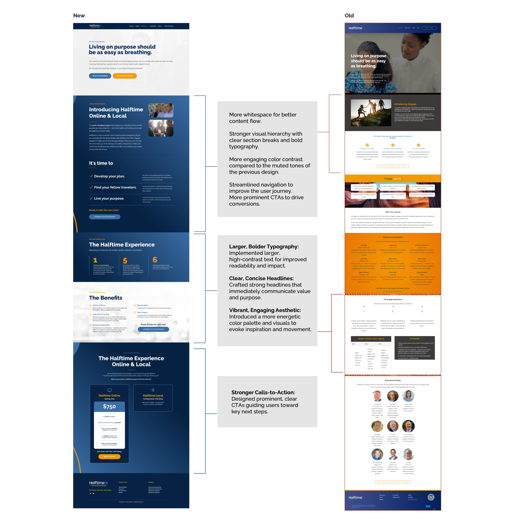
Larger, Bolder Typography:
Implemented high-contrast text for improved readability and impact, ensuring key messages stand out.
Clear, Concise Headlines:
Crafted strong, direct headlines that immediately communicate value and purpose.
Vibrant, Engaging Aesthetic:
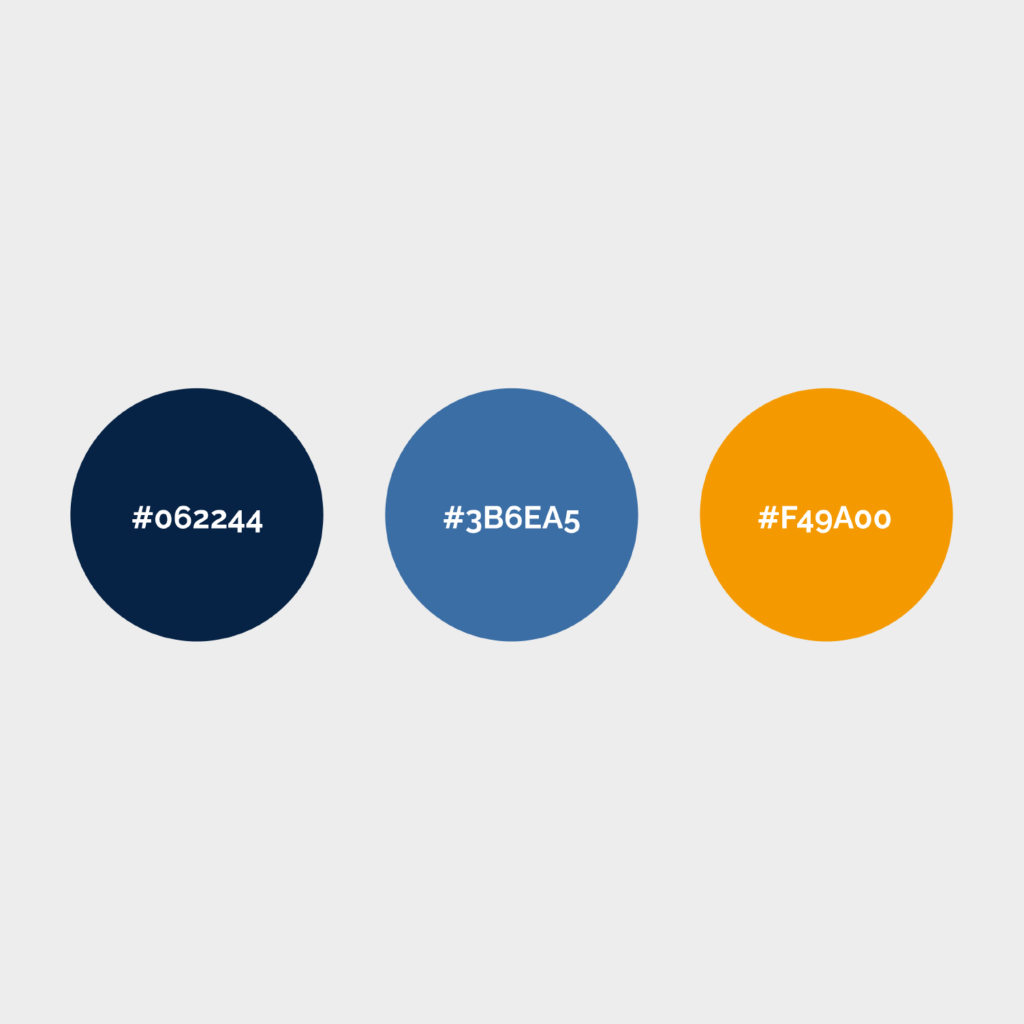
Introduced a more energetic color palette and visuals to evoke inspiration and movement, replacing the muted tones of the previous design.
More Whitespace & Structured Layout:
Created a clean, modern design that enhances readability and guides the user’s journey effortlessly.
Stronger Calls-to-Action:
Designed prominent, strategically placed CTAs that direct users to take meaningful actions.
Enhanced Manageability:
Optimized the backend structure for easier content updates and future scalability.

The Results
Maintains Brand Recognition:
while introducing a cleaner, more refined look.
Enhances readability
with bolder typography and improved spacing.
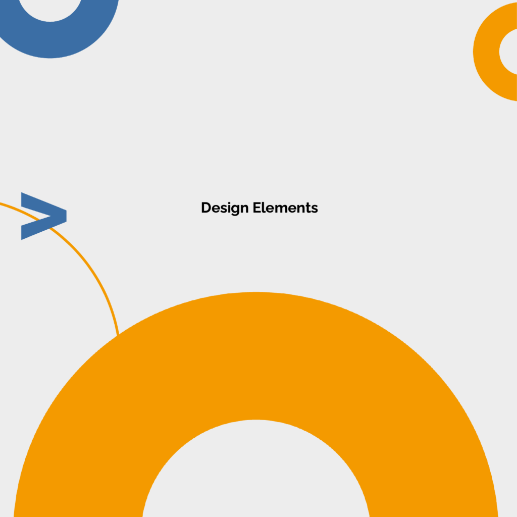
Incorporates a dynamic element
to reflect movement and transformation, aligning with Halftime’s mission.
Client Testimonials


Final Thoughts
The Halftime brand and website transformation successfully elevated the organization’s digital presence, making it more compelling and accessible. This redesign ensures that Halftime continues to inspire and equip individuals in their journey from success to significance.
